Some thoughts on infographic street art
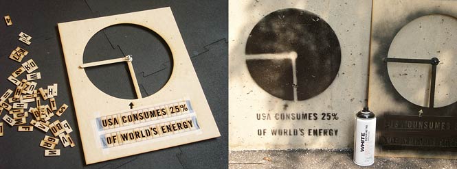
15 June 2011 / infovis, project, reflectionEarlier this week I presented “Infoviz Graffiti“, an adjustable lasercut stencil for the rapid deployment of pie-chart infographics. Shortly thereafter, Nicola Bozzi of Owni.eu, and Suzanne LaBarre of FastCompany.com, independently contacted me seeking interviews. Their questions were complementary so I have compiled my responses to them here.
How did you come up with the concept for this project?
Graffiti and information visualization have been long-term interests of mine. A few months ago, someone tweeted something about “graffiti infovis” and I immediately thought they had done something like this. When I followed their link, however, it just turned out to be some charts and maps depicting statistics about graffiti in their neighborhood. My accidental mental reversal (from “graffiti infovis” to “infovis graffiti”) stuck with me, got me thinking, and prompted this design.
Is this project meant for graffiti artists? Data viz designers? Both?
Your question implies that these are two separate occupations. My project hints at a world in which they are one and the same.
Is the political and emancipatory potential of information and communication today, in the age of the Internet and so-called Twitter revolutions, really bigger than the past, or is it all still about taking the streets?
Our information-environment interpenetrates the fabric of urban space. (Kevin Slavin has even convincingly argued that urban space now conforms itself to the needs of information flows.) But this relationship is not owed to some new feature of augmented-reality iPhone apps. It has always been this way; before the Internet, we had the agora, the pashkevil, the broadside. Information and urban space have always been coextensive, and impinge on each other; this is why e.g. the locus of the “Twitter revolution”, if there really is such a thing, is the Arab public square and not the PC in the family office. My stencil project simply corrects a technological bias in the ways we typically receive and consume visual displays of this information: a correction to the overprivileging of the digital screen and printed paper as the expected vehicles of information transmission and exchange. The pie-chart stencil addresses a paucity of tools for the high-speed reproduction of infographic messages in and around urban surfaces.
Do you think the pairing of infographics and graffiti is a natural marriage?
I do. Whether on the cover of USA Today or in the proceedings of the IEEE Conference on Visual Analytics, information graphics have become a dominant and readily-digestible mode of visual communication. People’s visual literacy for information graphics has never been greater. Of course, infographic conventions, like pie charts, exist for a reason: they’re possibly the most effective way to convey certain kinds of information, like percentages and ratios. On the flip side, street art and other vernacular modes of tactical visual communication are culturally voracious; they will engulf and adapt any techniques that suit their purposes. Technology transfer from the research lab to the street is inevitable when it’s politically imperative for those data to be communicated.
The greatest potential for infographic street art, it seems to me, has yet to be explored. It’s what I would call “locative infographics”, or “situated visualization” — which is what happens when the content of the visualization-graffiti is tightly coupled to the specific location at which it has been deployed. To take a concrete example, a spraypainted pie chart such as I have presented could convey the percentage of minority employees at some facility, or the percentage of a building’s energy obtained from clean sources. Other graphic devices, such as bar charts and histograms, could convey statistics about crime at a given location; this strategy would be most effective when deployed as a series of small multiples, e.g. allowing in-situ comparison of every address on a given street. (Others have presented situated visualizations using electronic means. For example, Chris Frauenberger has pointed out that some related work using locative electronic displays (e.g. The Pulse of Tidy Street) has been done by the Change Project. Augmented reality (AR) systems of this type also exist, such as SiteLens (2009, PDF), by Sean White of Columbia University.)
What can graffiti and infoviz learn from each other and how can they improve each other as media?
Earlier this week, someone generously tweeted that my project was “Banksy meets Tufte“. Although that’s high praise – both of these men are personal heroes – this remark definitely delineates the territory I’m seeking to explore. Certainly, it’s clear that Banksy and Tufte both share an aesthetic of graphic efficiency and a faith in the communicative power of simple messages. And of course, both street art and infographics depend on extreme visual economy to communicate effectively and memorably: graffiti must be quick to execute, charts must be easy to read. The key, I believe, is that both must also provoke. What makes my project significant, I hope, is that it reminds people that even a simple pie-chart can be used to communicate information that matters. It prompts us to question what information is worth visualizing, and why. Furthermore, by situating quantitative visual information in urban space, this project also compels us to commit to a confrontation with a specific audience in a specific locale.
It seems clear that the field of information visualization possesses tools and media which, suitably adapted, can bring new communicative capacities to street art. If street art has lessons for infographics, on the other hand, it is to remind us of the pressing need to explain the egregious problems of the world today, to the widest possible audience, and to prompt tactical thinking about how (and where) this be done most effectively. What data is essential to communicate to others? Can the insertion of that data, semi-permanently, into urban space, change people’s behavior? When is it worth risking arrest to ‘publish’ that information? These are the questions I hope my stencil project raises.
Why make the design available for free online?
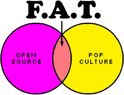
The pie-chart stencil is free and online so that there’s the least possible barrier, whether financial or logistic, to people obtaining and using it! I’d like to point out some important context, though, which is that the design was released as a project of F.A.T. – the Free Art and Technology Lab – an artist collective, of which I am a member, “dedicated to enriching the public domain through the research and development of creative technologies and media.” The F.A.T. Lab works at the intersection of popular culture and open-source: grabbing people’s attention with, and giving them the tools to engage with, memes that matter. This approach is well-described by the F.A.T. Lab’s visual Venn Diagram motto which, come to think of it, is also an infographic.
As a media artist, what do you feel your personal duty is while intervening on the public imagination?
As an artist, I try to leave the world a more interesting place. I’m also an educator, so I care that people learn something new, and become empowered in some way.
« Prev post: See Yourself Sensing (London Exhibition)
» Next post: QR_STENCILER and QR_HOBO_CODES

